
WasteProtection - Brand Design
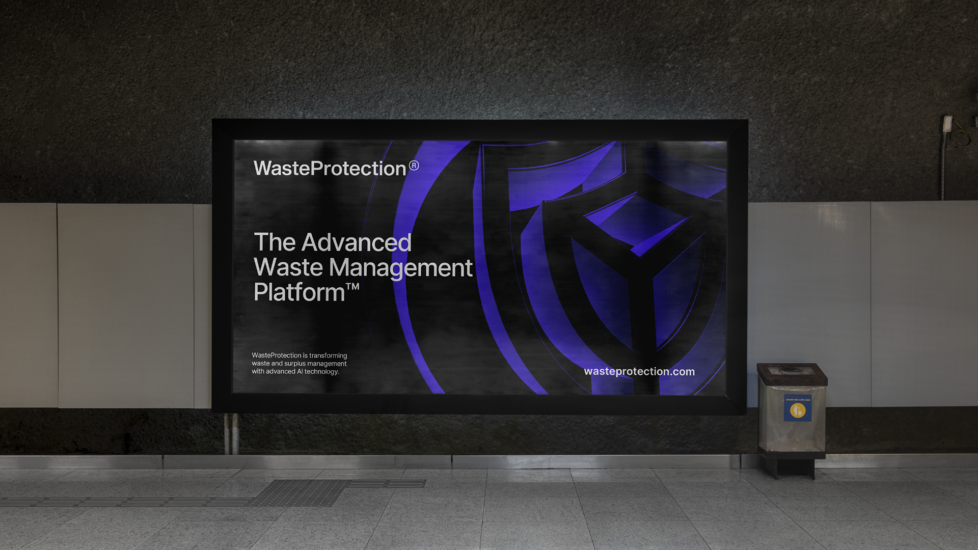
Advanced Waste Management Platform
(pt-br) WasteProtection é a primeira plataforma inteligente de gestão de resíduos do mundo, combinando Inteligência Artificial, IoT e automação para transformar a forma como empresas, governos e indústrias lidam com resíduos, rastreabilidade e economia circular.
O desafio deste projeto foi traduzir uma solução altamente técnica e sistêmica em uma identidade visual clara, confiável e escalável, capaz de operar em ambientes digitais complexos, comunicações institucionais e interfaces de produto, mantendo consistência e autoridade global.
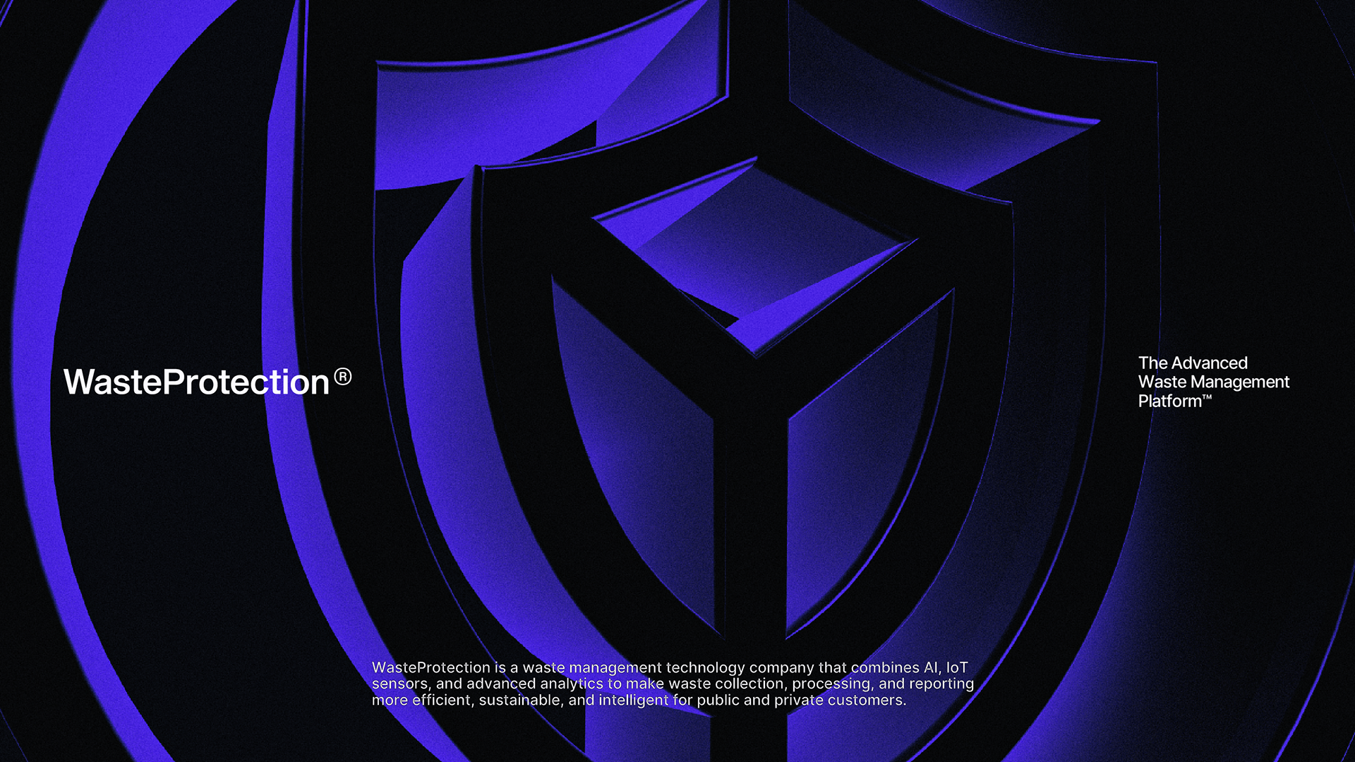
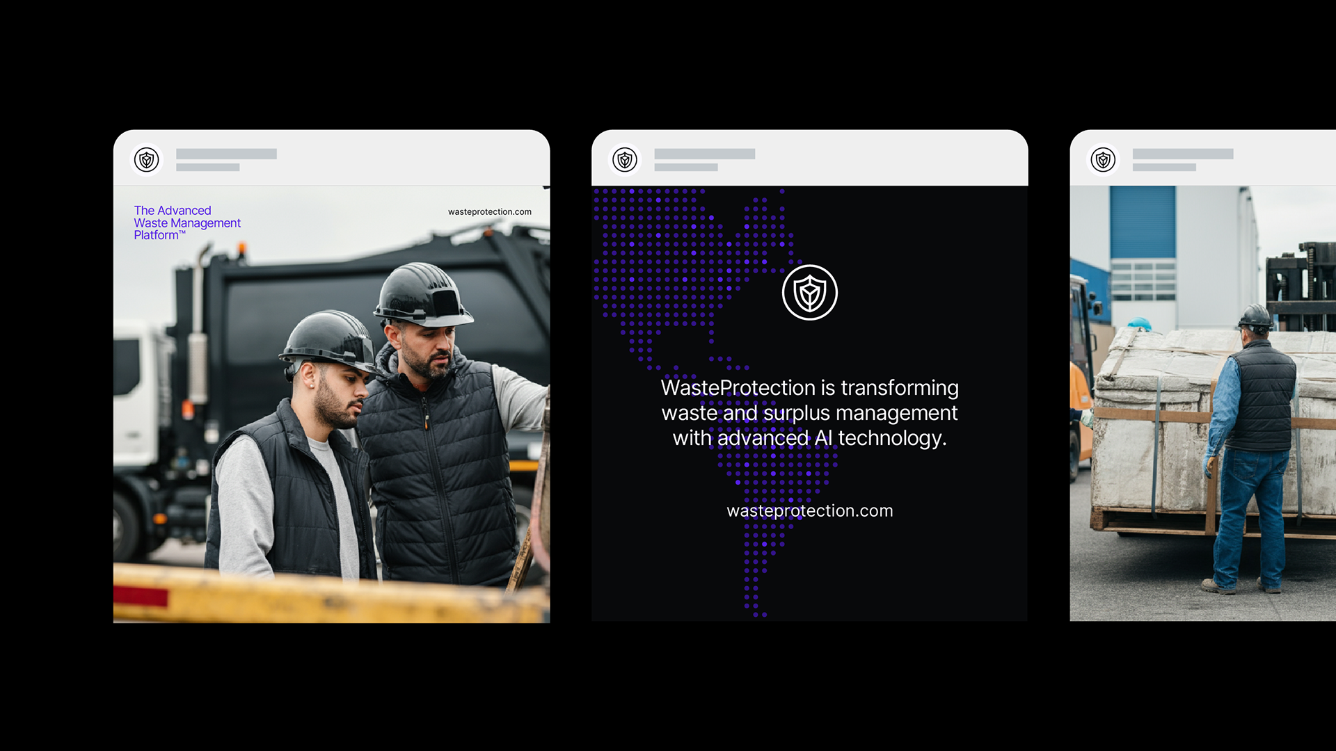
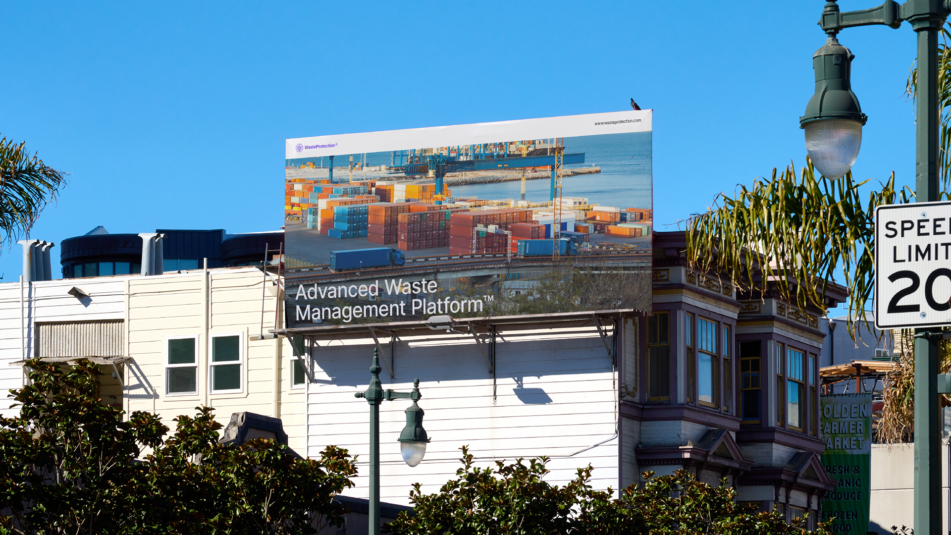
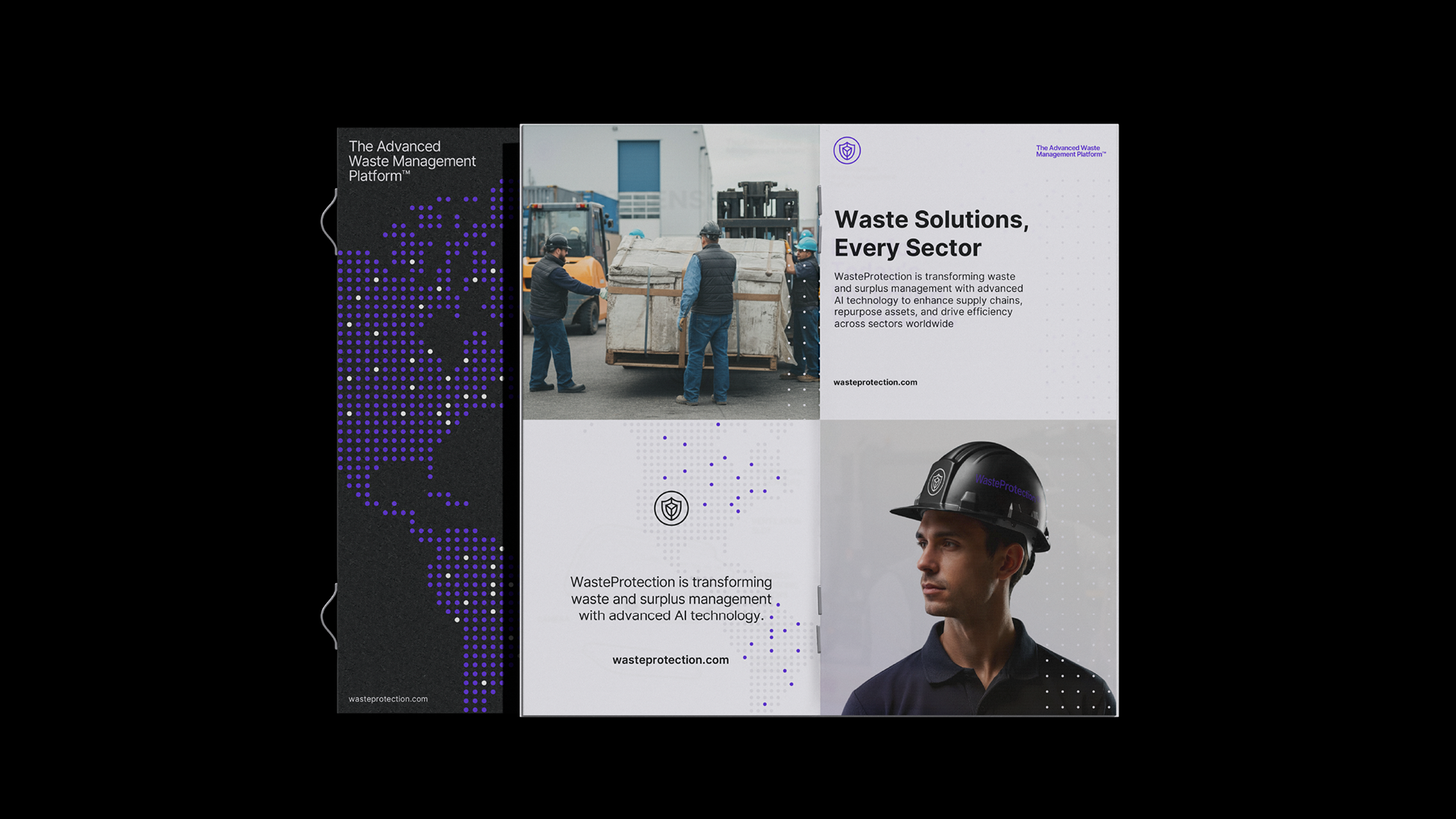
(en) WasteProtection is the world's first intelligent waste management platform, combining Artificial Intelligence, IoT, and automation to transform how companies, governments, and industries deal with waste, traceability, and the circular economy.
(en) WasteProtection is the world's first intelligent waste management platform, combining Artificial Intelligence, IoT, and automation to transform how companies, governments, and industries deal with waste, traceability, and the circular economy.
The challenge of this project was to translate a highly technical and systemic solution into a clear, reliable, and scalable visual identity capable of operating in complex digital environments, institutional communications, and product interfaces, while maintaining consistency and global authority.
Direction: João Pereira
Design: Yahya Umar, João Pereira
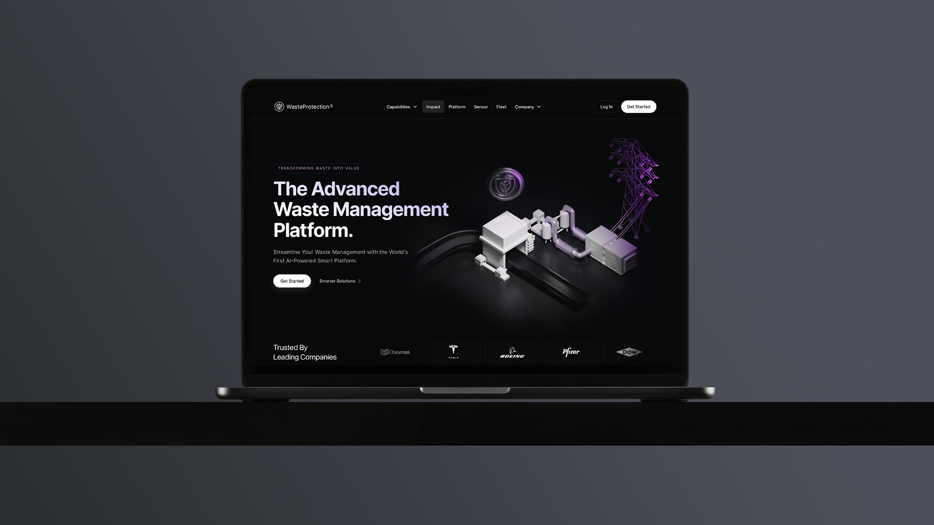
UI/UX Design: Karan Singh
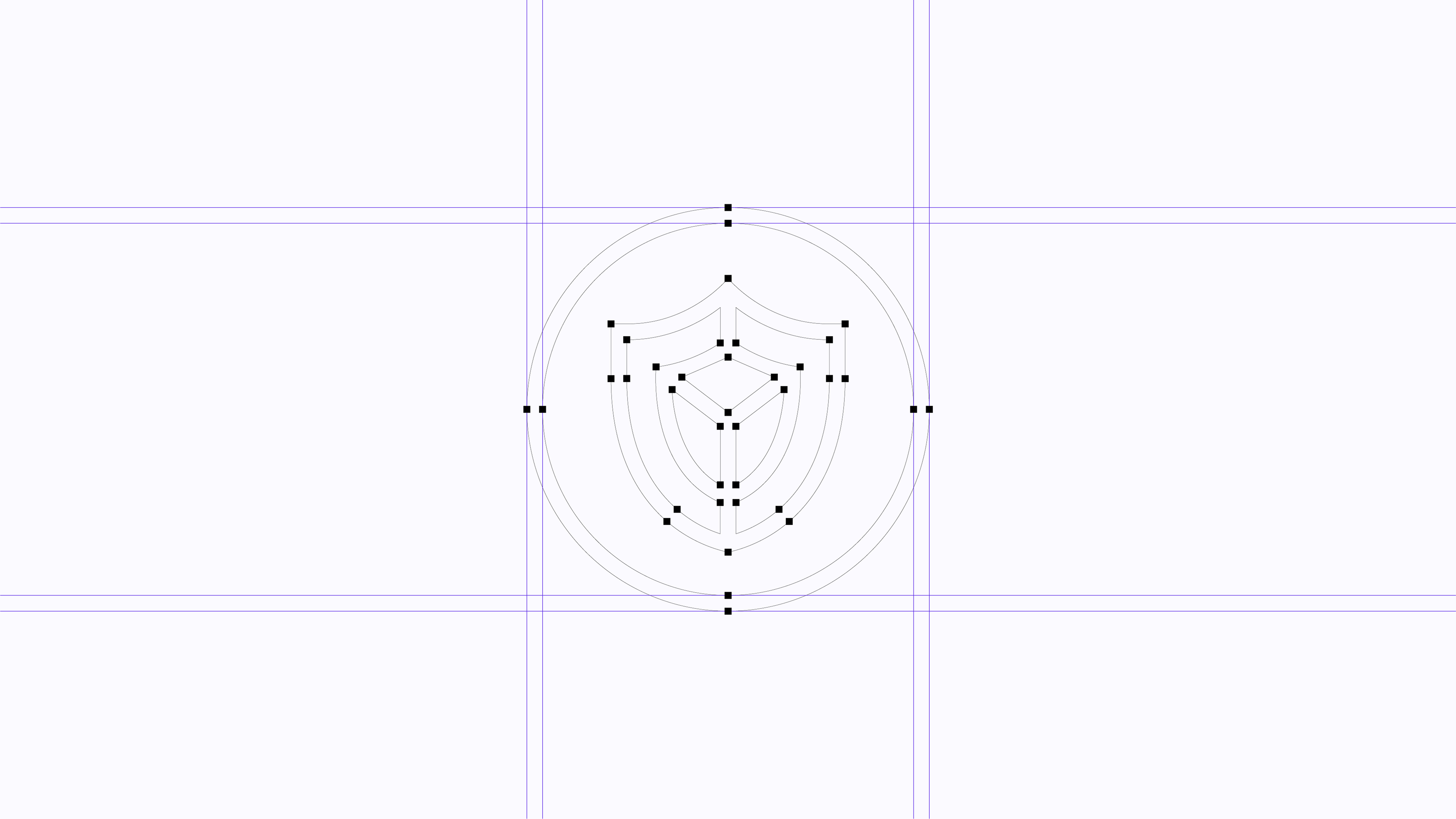
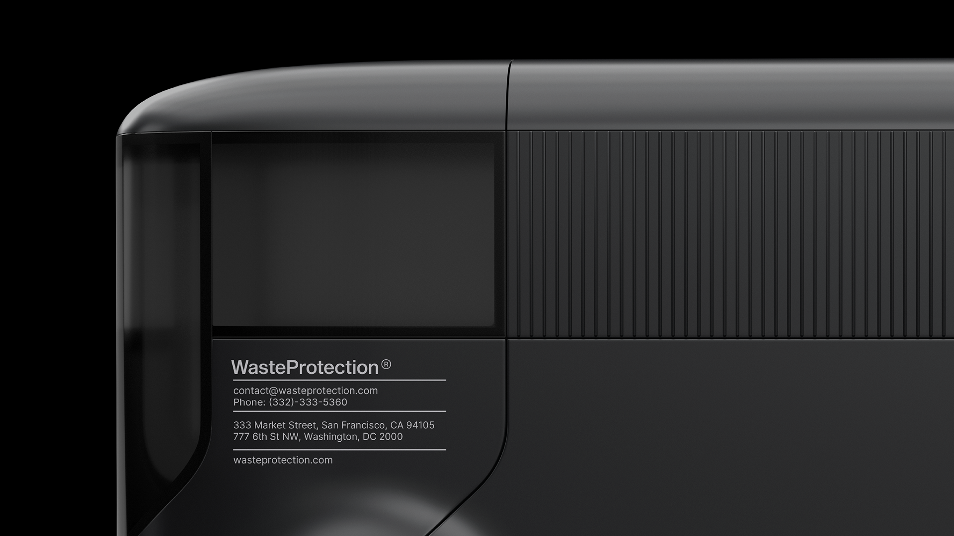
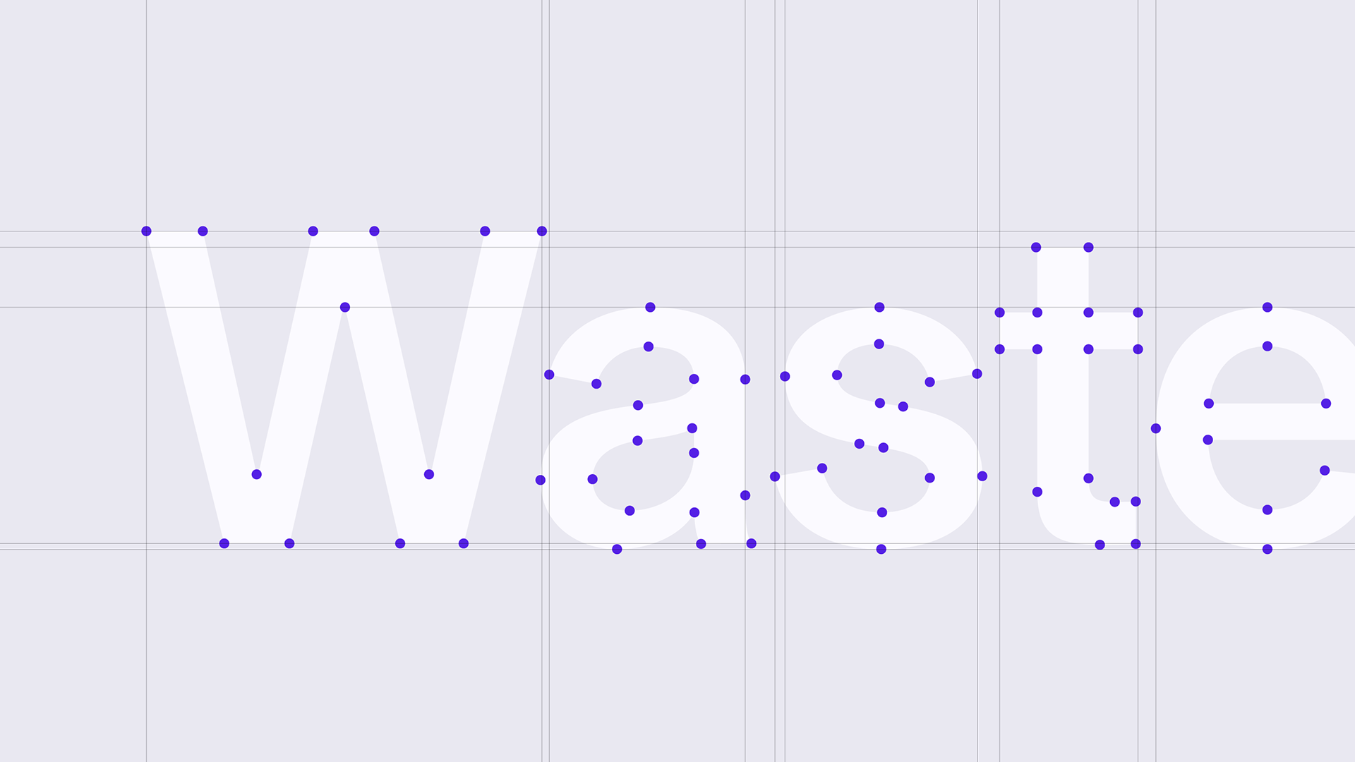
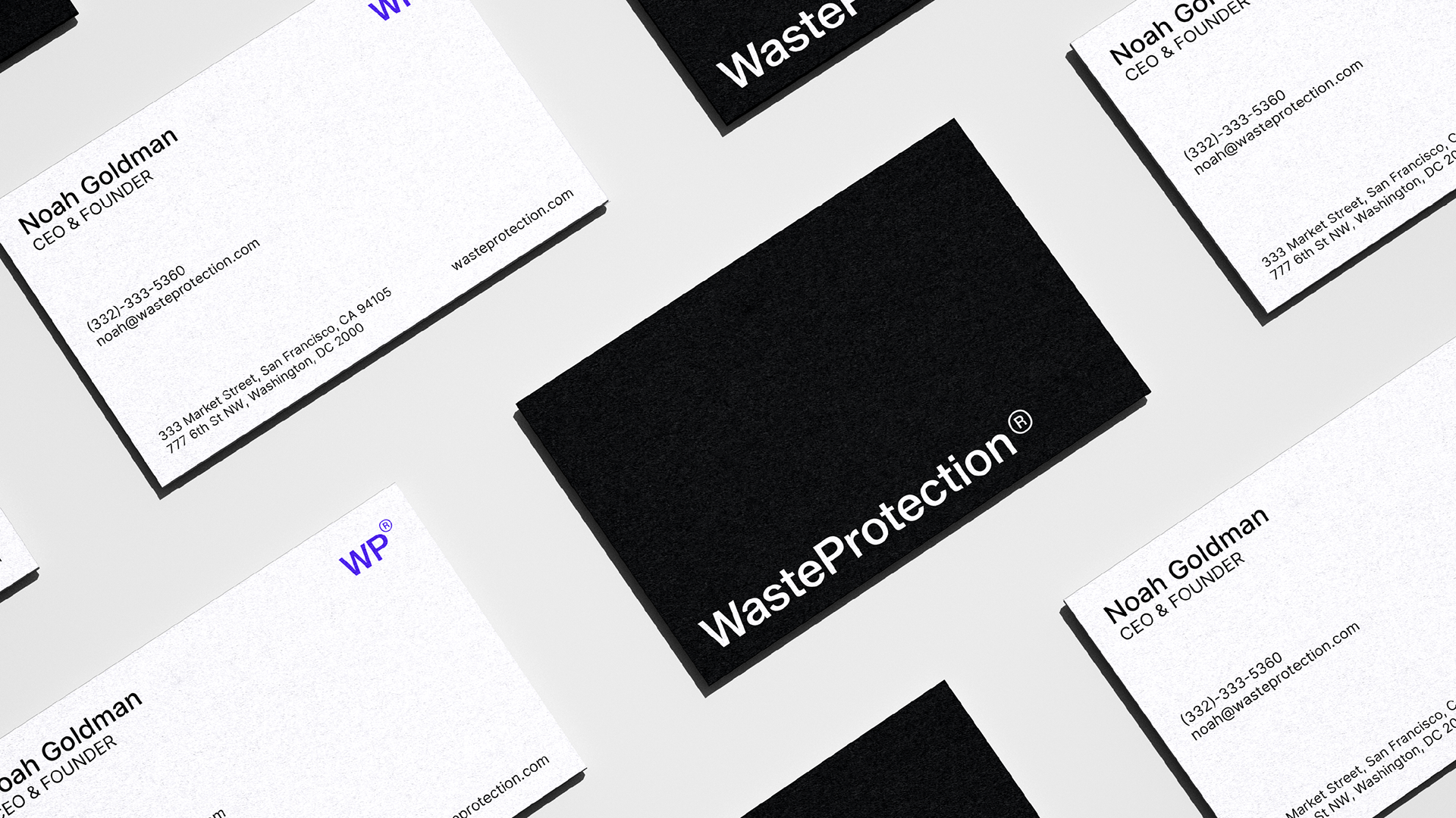
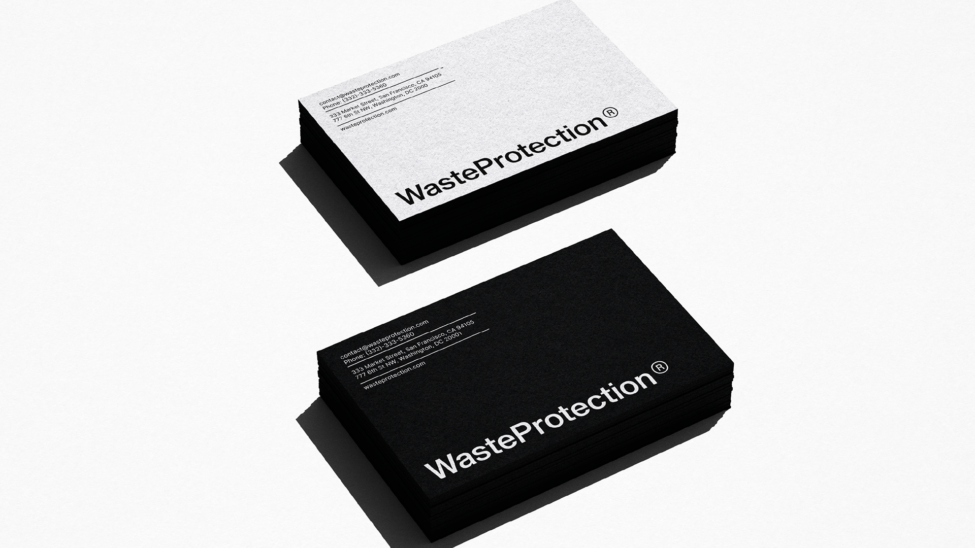
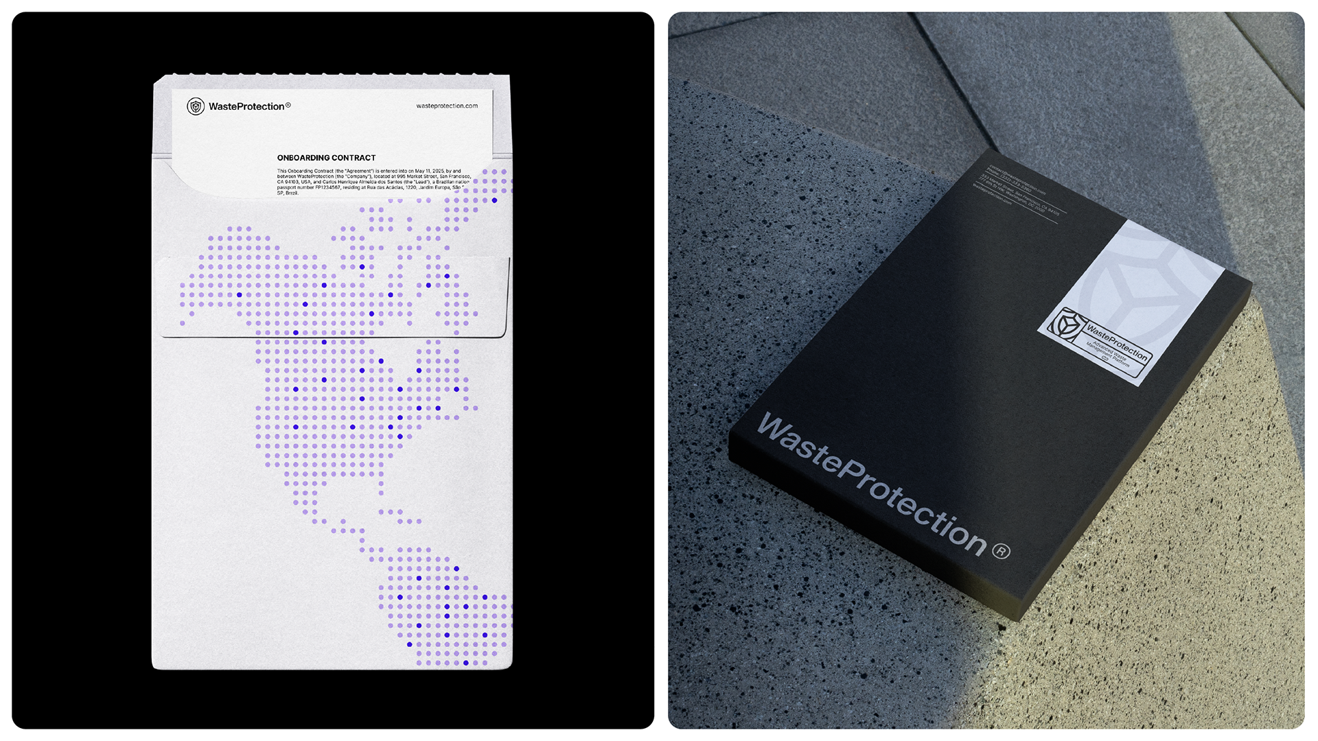
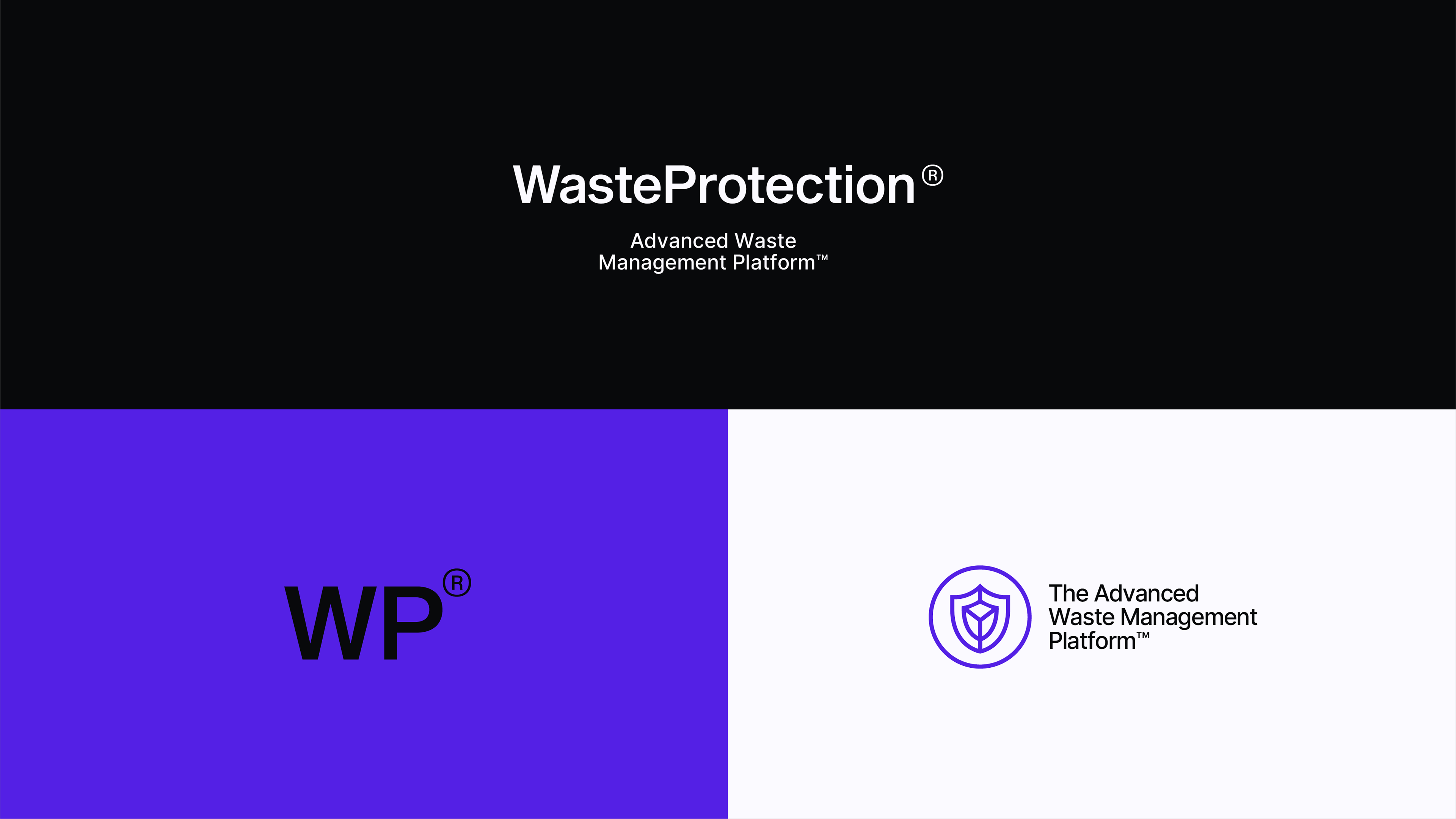
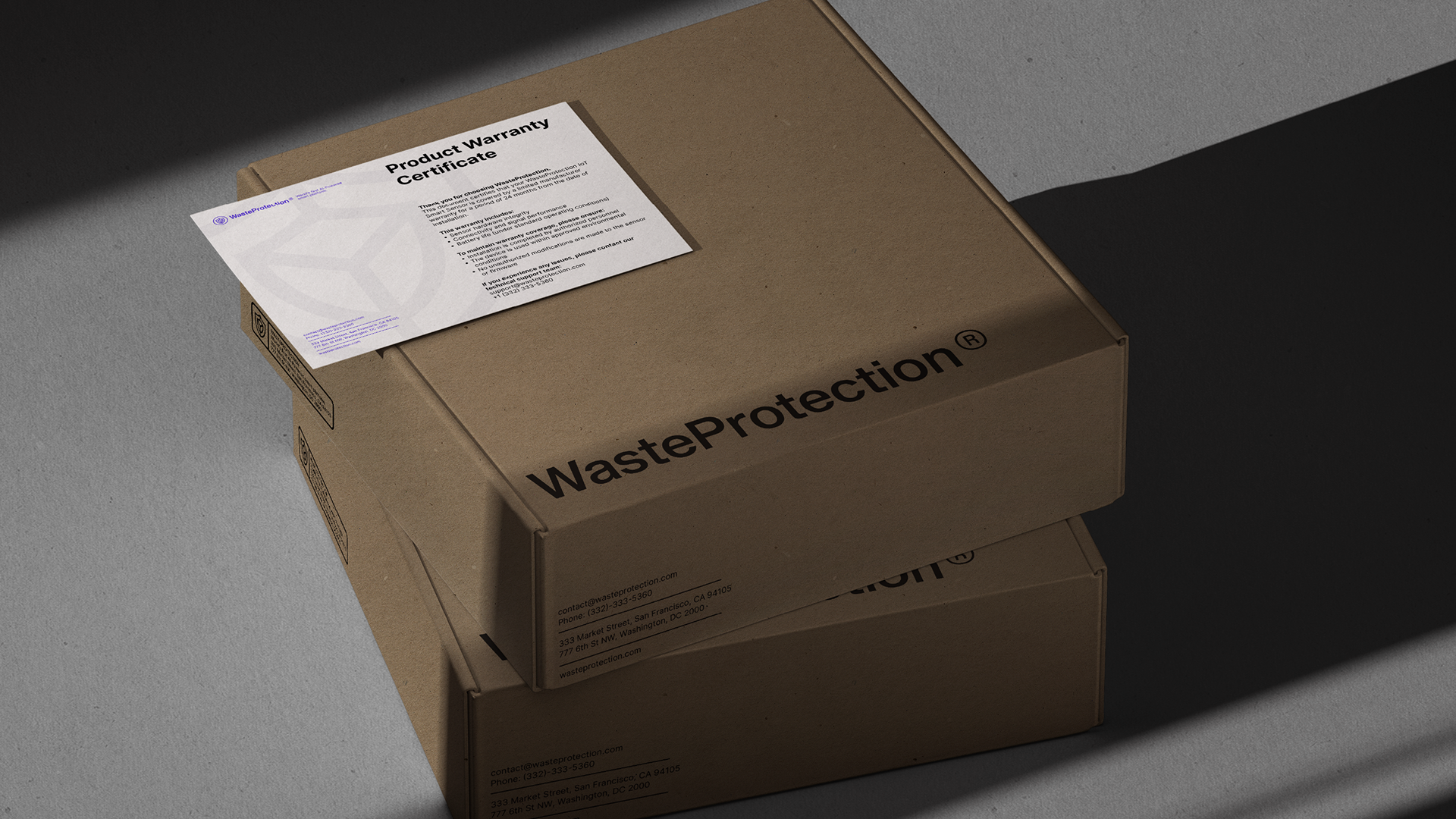
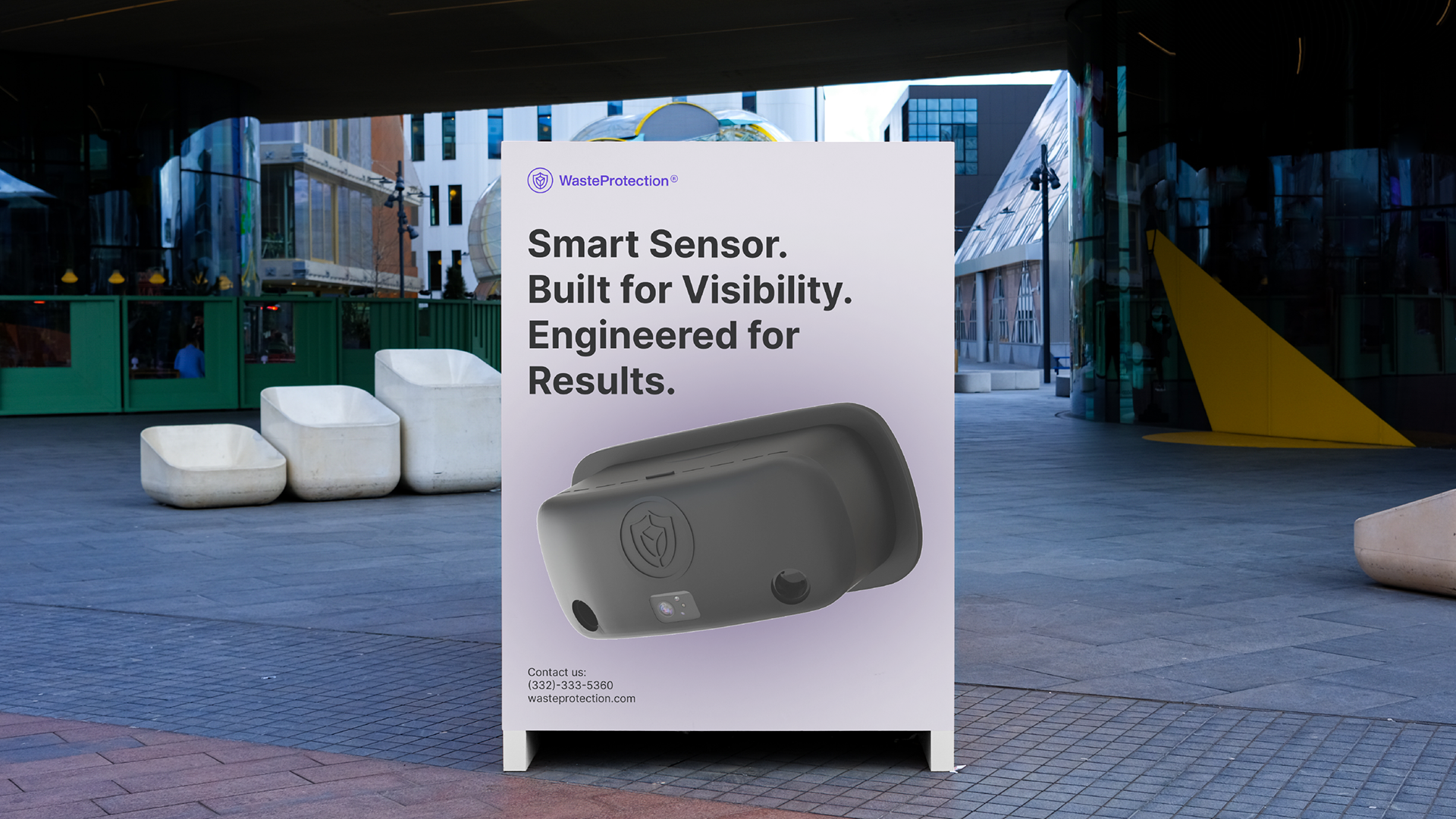
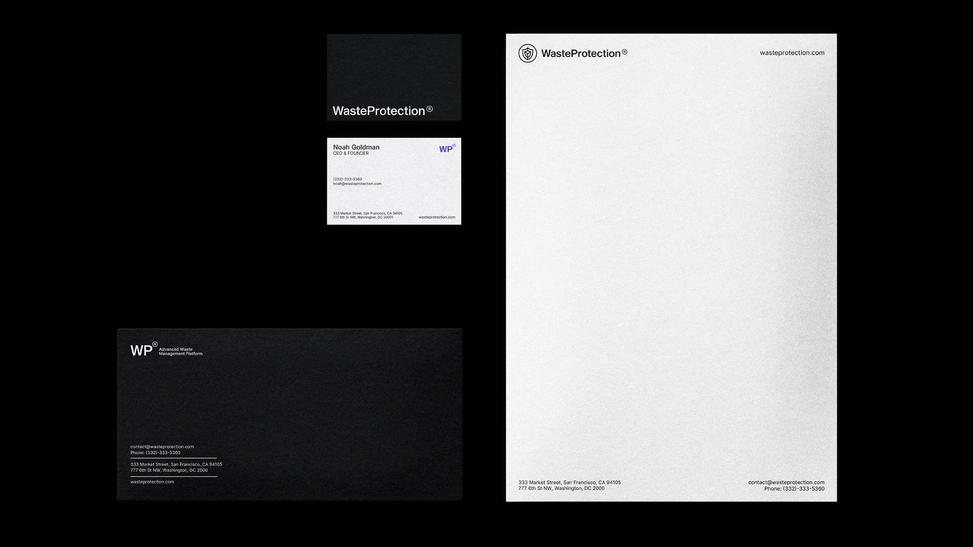
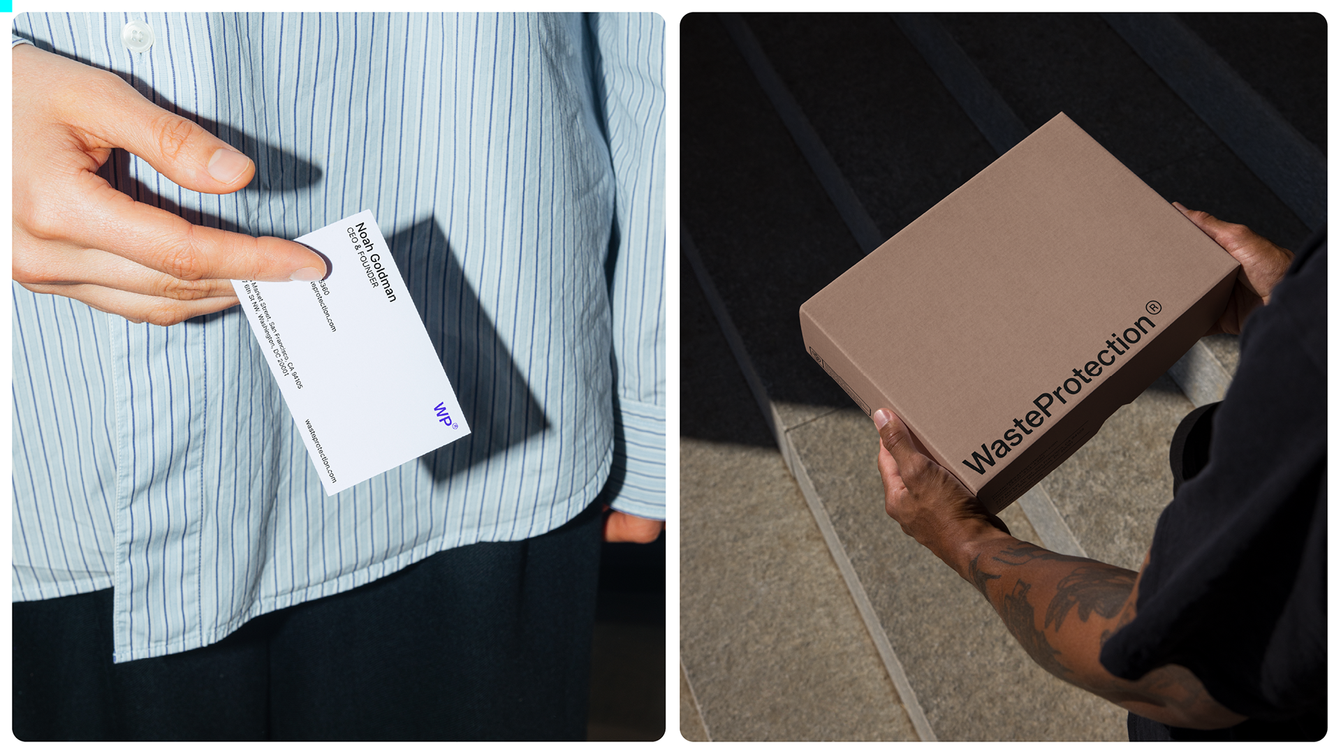
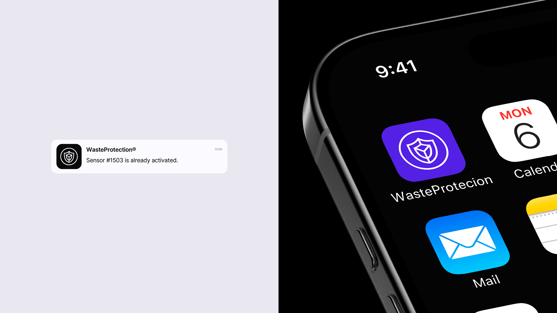
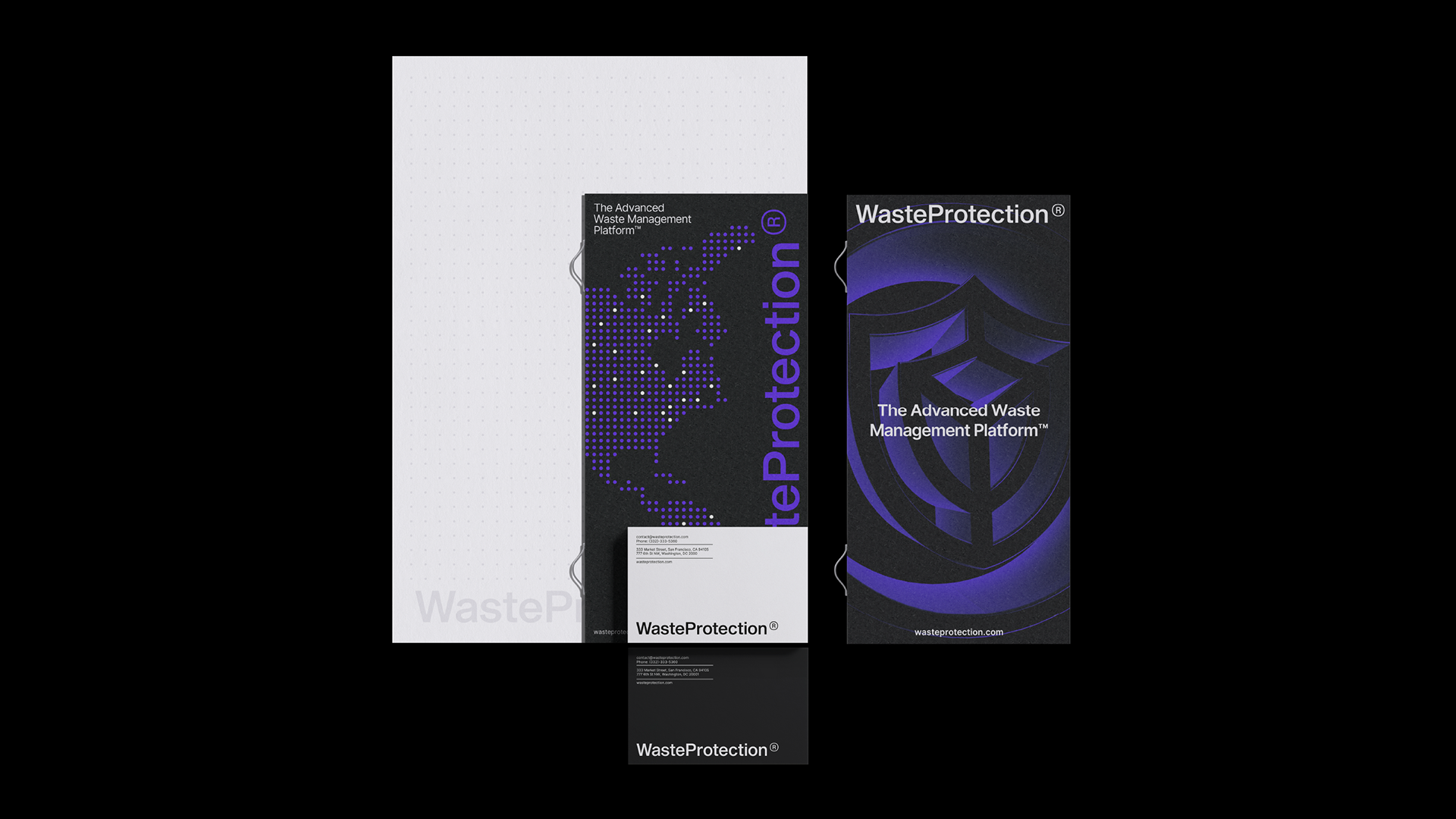
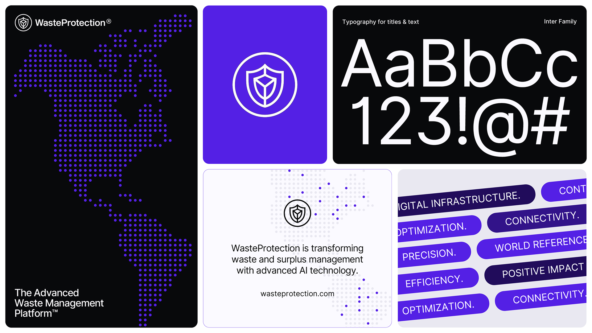
(pt-br) O logotipo foi desenvolvido como um wordmark técnico e equilibrado, acompanhado por um símbolo em forma de escudo que remete à proteção, segurança e controle. Esses conceitos estão diretamente ligados à proposta da plataforma, que trabalha com rastreabilidade, compliance e gestão inteligente de resíduos. O sistema do logo conta com regras rigorosas de aplicação, margens de segurança, reduções mínimas e posicionamentos definidos, garantindo consistência e reconhecimento em qualquer contexto, do digital ao institucional.
(en) The logo was developed as a technical and balanced wordmark, accompanied by a shield-shaped symbol that refers to protection, security, and control. These concepts are directly linked to the platform's proposal, which works with traceability, compliance, and intelligent waste management. The logo system has strict application rules, safety margins, minimum reductions, and defined positioning, ensuring consistency and recognition in any context, from digital to institutional.
(en) The logo was developed as a technical and balanced wordmark, accompanied by a shield-shaped symbol that refers to protection, security, and control. These concepts are directly linked to the platform's proposal, which works with traceability, compliance, and intelligent waste management. The logo system has strict application rules, safety margins, minimum reductions, and defined positioning, ensuring consistency and recognition in any context, from digital to institutional.

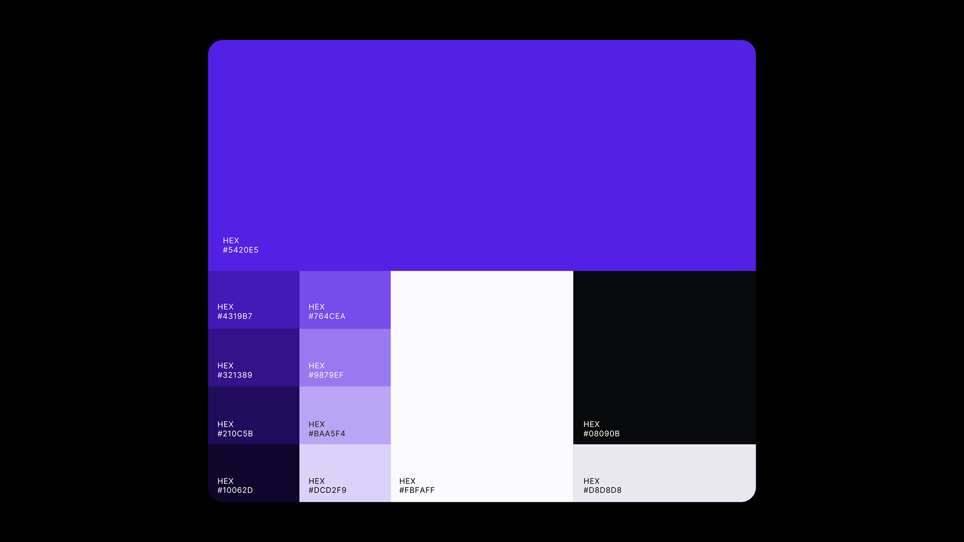
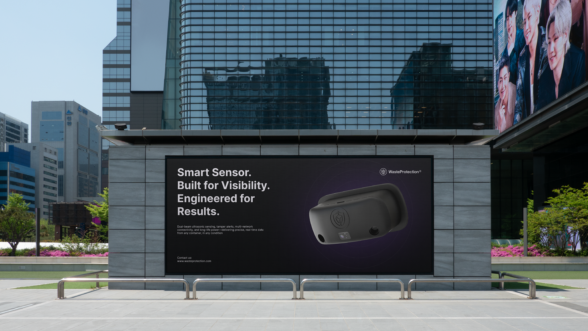
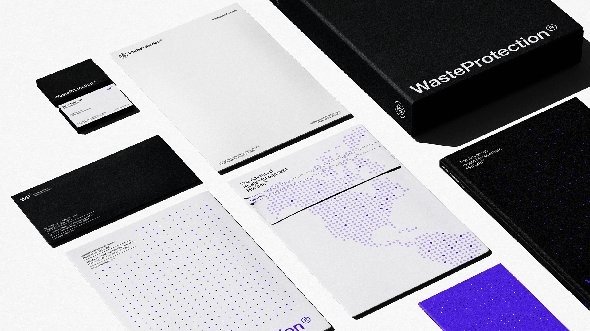
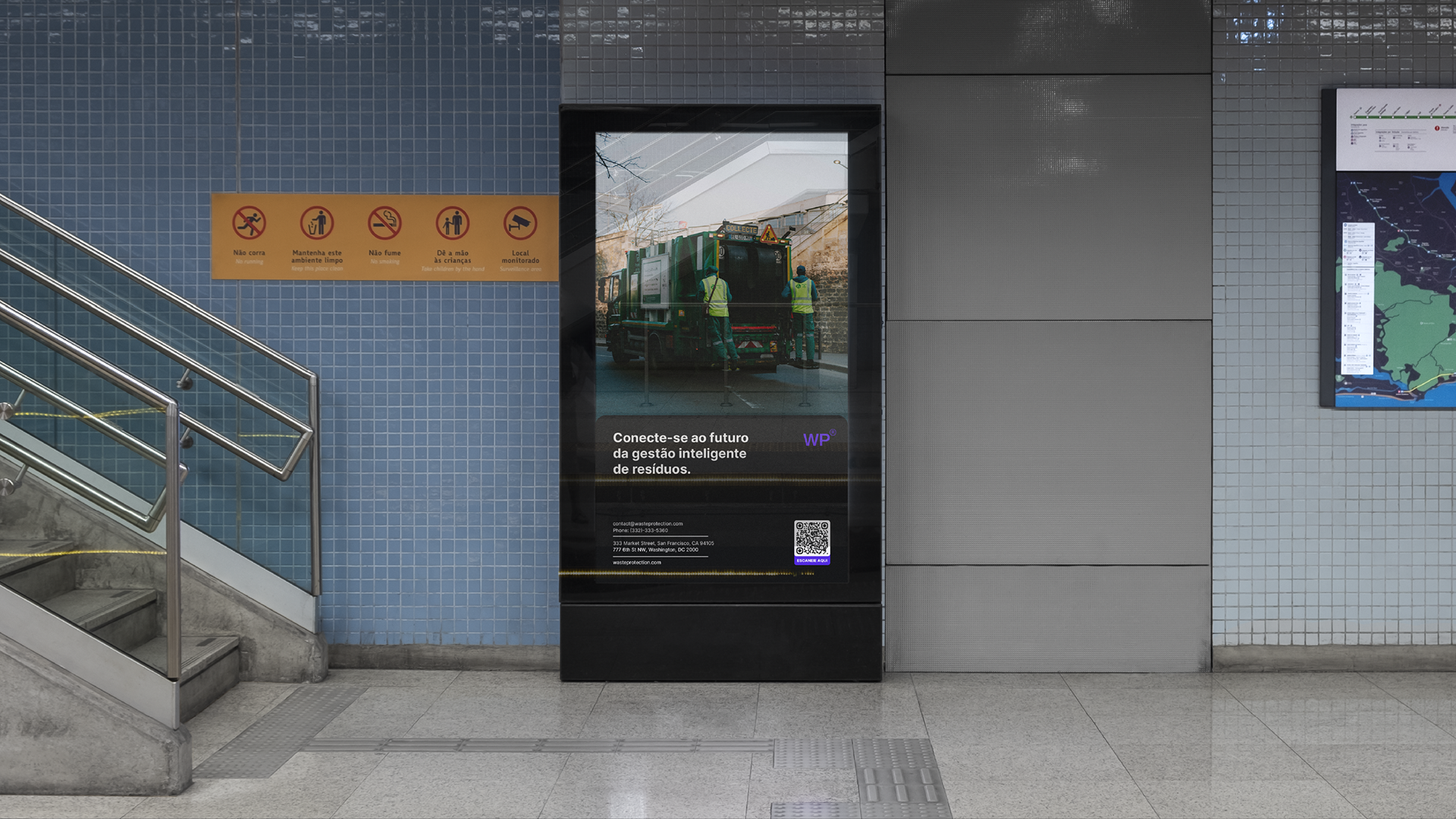
(pt-br) A paleta de cores é composta principalmente por tons profundos de roxo, apoiados por neutros claros e escuros. Essa escolha cromática comunica tecnologia, sofisticação e estabilidade, criando uma atmosfera visual alinhada ao universo de inteligência artificial e dados. O uso controlado de variações dentro do mesmo espectro garante profundidade visual sem comprometer a legibilidade, tornando o sistema especialmente eficiente para interfaces digitais e produtos SaaS.
(en) The color palette consists mainly of deep shades of purple, supported by light and dark neutrals. This color choice communicates technology, sophistication, and stability, creating a visual atmosphere aligned with the world of artificial intelligence and data. The controlled use of variations within the same spectrum ensures visual depth without compromising readability, making the system particularly effective for digital interfaces and SaaS products.
(en) The color palette consists mainly of deep shades of purple, supported by light and dark neutrals. This color choice communicates technology, sophistication, and stability, creating a visual atmosphere aligned with the world of artificial intelligence and data. The controlled use of variations within the same spectrum ensures visual depth without compromising readability, making the system particularly effective for digital interfaces and SaaS products.
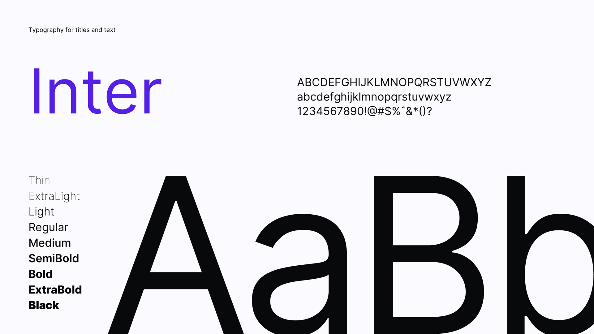
(pt-br) A tipografia principal escolhida foi a Inter, uma fonte sans-serif contemporânea amplamente utilizada em produtos digitais por sua clareza e versatilidade. O sistema tipográfico trabalha com diferentes pesos para criar hierarquia e organização, permitindo que informações complexas sejam apresentadas de forma acessível e direta. A tipografia não busca protagonismo estético, mas atua como uma ferramenta essencial para a clareza e eficiência da comunicação.
(en) The main typeface chosen was Inter, a contemporary sans-serif font widely used in digital products for its clarity and versatility. The typographic system works with different weights to create hierarchy and organization, allowing complex information to be presented in an accessible and direct way. The typography does not seek aesthetic prominence, but acts as an essential tool for clarity and efficiency in communication.
(en) The main typeface chosen was Inter, a contemporary sans-serif font widely used in digital products for its clarity and versatility. The typographic system works with different weights to create hierarchy and organization, allowing complex information to be presented in an accessible and direct way. The typography does not seek aesthetic prominence, but acts as an essential tool for clarity and efficiency in communication.
LET'S WORK TOGETHER
BRANDSBYJP 2025 - / Instagram / Behance
BRANDSBYJP 2025 - / Instagram / Behance